Kith Studio
View site

Research and Planning
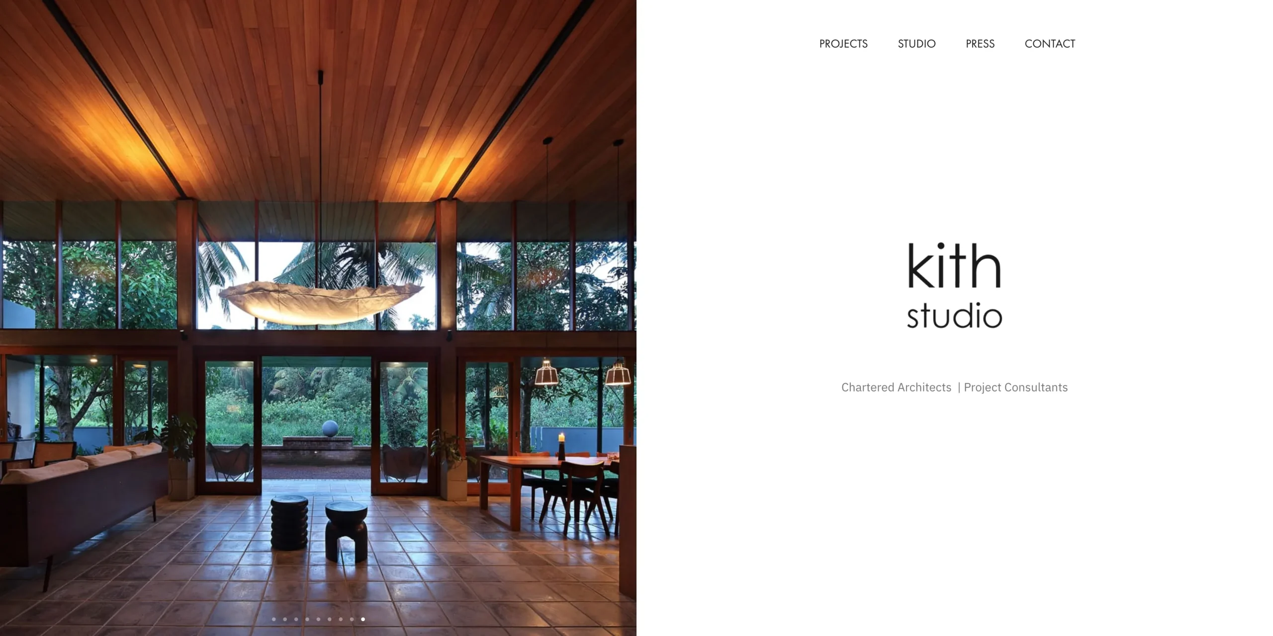
The primary challenge for Kith Studio was solving the ‘Visual Clutter’ pain point common in many architectural websites. Our research focused on the concept of ‘Digital Proportions’—ensuring that the website’s whitespace and grid systems mirrored the client’s own architectural philosophy. We planned a minimalist architectural portfolio that prioritizes high-resolution project imagery while maintaining the professional authority of a Chartered Architect.
Core Features and Design Enhancements
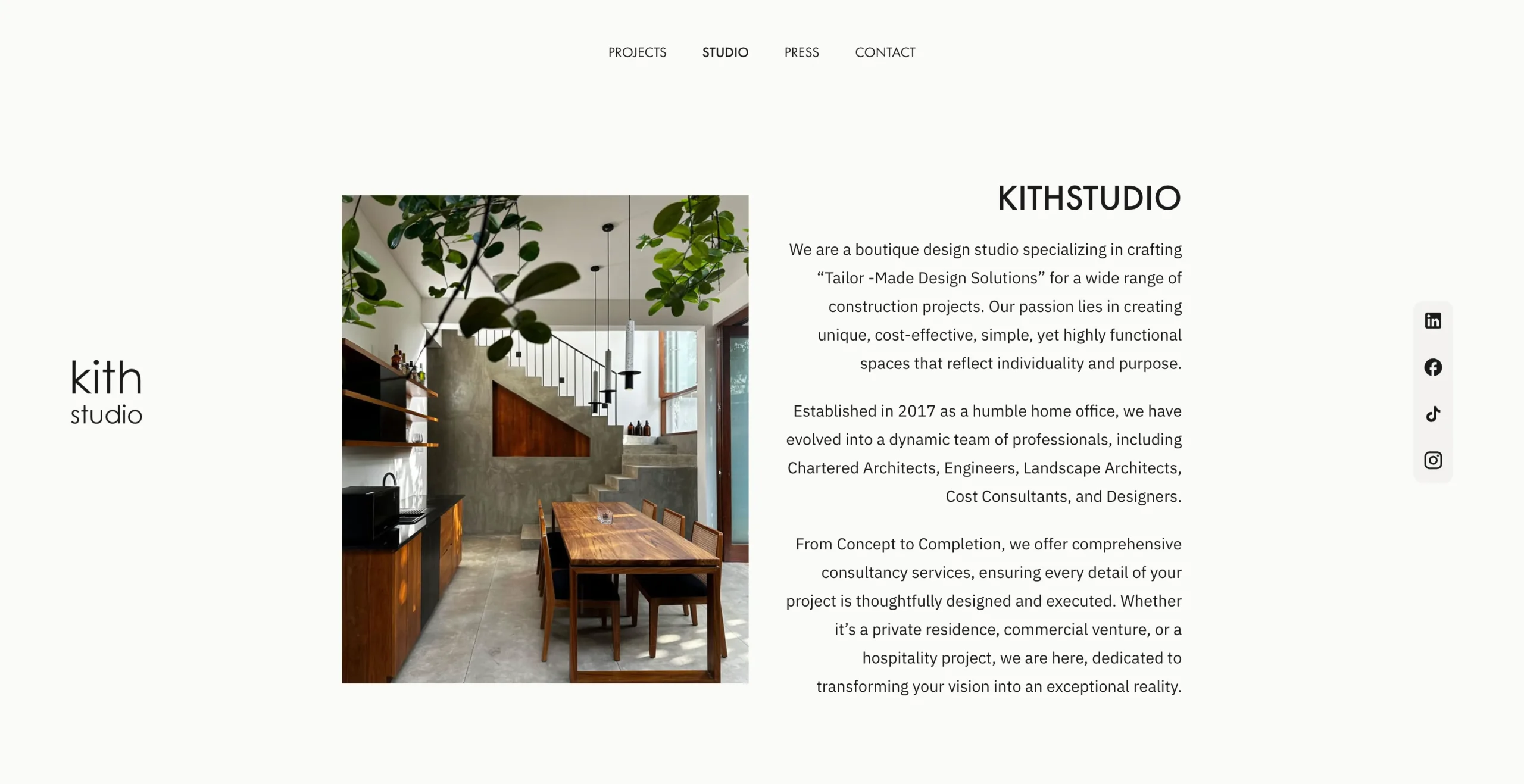
The website’s navigation was crafted for simplicity while ensuring a visually rich experience. The final design incorporated a structured approach with well-defined sections for Mr. Kithmina’s portfolio, services, and client interactions.
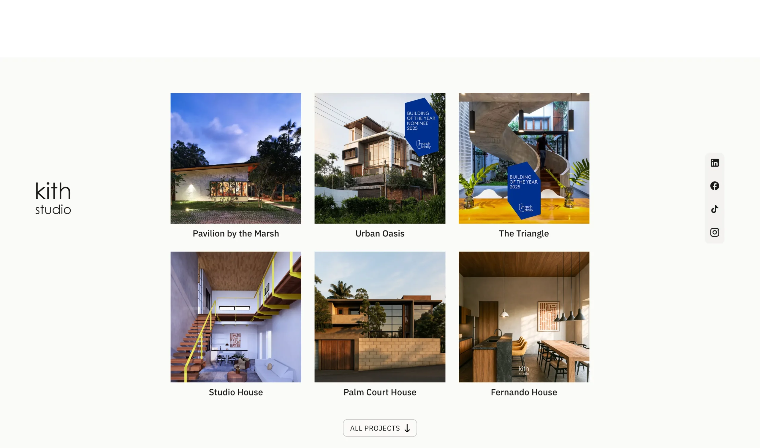
Golden Ratio Grid
A custom layout built on architectural proportions to solve the ‘Disjointed Portfolio’ pain point.
High-Fidelity Imagery
Optimized image-loading for ultra-HD renders, ensuring zero lag and high user retention.
Minimalist Navigation
A ‘Less-is-More’ UI that eliminates user cognitive load, allowing the work to speak for itself.
Development Workflow
Conceptual Design
Solving the ‘Generic Template’ pain point with a bespoke, grid-based UI.
Prototyping
Fine-tuning aspect ratios and typography to match the Kith Studio brand identity.
Frontend Precision
Building a pixel-perfect responsive site that looks elite on 5K monitors and mobile.
Final Deployment
Deadline: 5 Weeks. A clean, search-optimized stage for architectural excellence.
Final Deliverable
The final deliverable for Kith Studio is a digital landmark that captures the essence of a Chartered Architect’s vision. By focusing on correct proportions and a minimalist aesthetic, we transformed a standard portfolio into a high-converting digital experience. The site now serves as a primary lead-generation tool for luxury residential and commercial projects, ranking for niche architectural terms while maintaining a premium brand feel.